Google announced a redesign of the Gmail web version at the end of January. Gmail’s new ‘Integrated View’ will add dedicated tabs for Google’s popular services to a new side menu. So, you will be able to seamlessly switch between different apps right from the Gmail account. Here is everything you need to know about this upgrade.
What you will see?
What is Gmail’s new ‘Integrated View’?
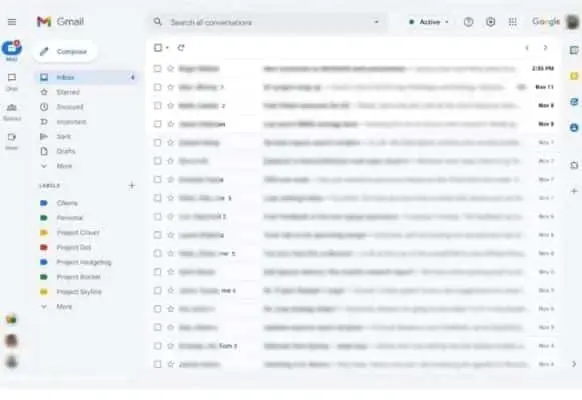
For quite some time, Google has been attempting to merge its messaging and communication features in Gmail. With Gmail’s new ‘Integrated View’, you will be able to switch between in one unified location. This includes Gmail, Chat, and Meet.
Where are the features located?
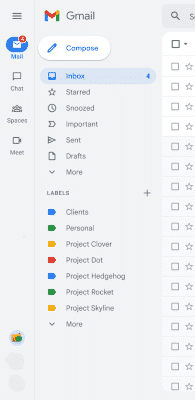
You will find a new collapsible side panel on the left side of the screen. This panel includes dedicated tabs for Google Mail, Chat, Spaces, and Meet. With this upgrade, you will be able to switch between Google apps instantaneously. Moreover, the panel allows you to do this straight from your Gmail accounts. When you hover the cursor over these tabs, you can also get a floating preview when the collapsible side panel is active. However, this is not the case for Google Meet.
App Menu UI
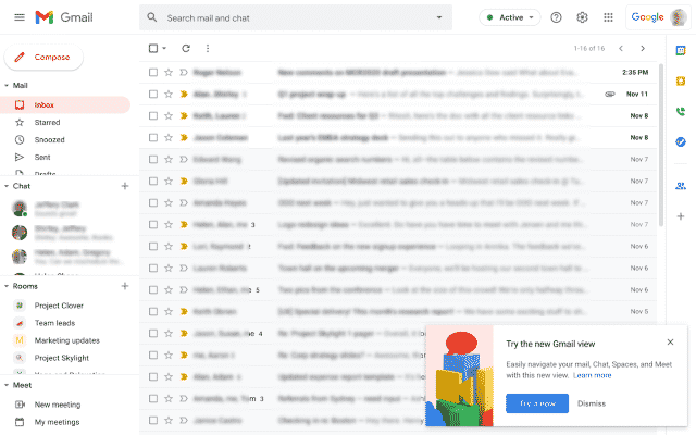
The redesign does not end here, you will also get a new app navigation UI and a notification bubble in the bottom-left corner to preview messages and answers. All Gmail users will be able to see the new integrated side panel as an optional feature.
How to see the Integrated View?
You can go to Quick Settings to try out the new Gmail view for your account. Moreover, once the view is available on your account, you will receive a new prompt to try it out. However, it might not be available for your account currently. You can switch back to the Classic view for your account by going to Quick Settings.
When you will be able to get the Integrated View?
By the end of Q2 2022, Google plans to make the new design the default display for Gmail. From April 2022, all users (both Rapid Release domains and users with Personal Google Accounts) will automatically see the new integrated view. Users have the option to opt-in prior to this. Although, customers of Google Workspace Essentials are not eligible for this. In the virtual office, you’ll soon be able to sample Google’s simpler, integrated Gmail overhaul. Also, by the end of the second quarter (that is, June), this will be the “standard experience” with no chance to go back.
How would the new design be helpful?
The “streamlined” web-based Chat client will be available with this upgrade. The integrated view is designed to make it easier to switch between mail, chats, and meetings without having to switch tabs. You’ll ultimately be able to search for emails and chats in one place. Google will also start notification bubbles to notify you of situations that require immediate attention. This will help you have a clearer focus, as well as a less jumbled-together interface than what you see today.
Why ‘Integrated View’?
Google’s decision looks to be a partial retaliation against competitors such as Microsoft Outlook. For recent Workspace converts, the revamp portrays Gmail as a more integrated, all-in-one software that can help them replace Outlook. Although it’s unclear whether the update will have that effect.
Conclusion
The new ‘Integrated View’ unites features like Mail, Chat, Spaces, and Meet in one place. Handling chats and meetings with the current Gmail interface can be a little perplexing. All the features on one screen don’t make the interface seem balanced and increase the data density. Moreover, if you like to concentrate on a single task at a time, the new design will provide easy access to other functions without having them constantly shown on the screen. Although, there will be ways to access your Chats from the email screen. According to a Google support page, new notifications will appear as a bubble in the left corner of the screen. Also, you’ll be able to create a little pop-up window within the interface to reply. The notification bubbles will let you know when other tools want your attention. This could be less distracting than seeing a list of all your Chats to the left or right of your emails.
What do you think about the redesign? Tell us in the comments section below!
Read More!
- Best E-commerce website builders in 2025: For small Businesses
- Use bubble and screen effects in Messages for iPhone and iPad!
- All the Basics about Gmail-Must know information!
- Use stickers and apps in Messages on iPhone and iPad!
- We bet you will find this Gmail features truly amazing!

